Let's get started!

preferred reply

Logo Footer

Office: 205 Durham Street (top floor)
Christchurch CBD 8011
PO Box 3871, Christchurch, NZ

Enquiries: 0800 30 8996
(03) 964 5305 - Reception
[email protected]

Web Support:
(03) 961 1106 - Support
[email protected]

Socials

Facebook X Instagram Vimeo
Activate Design Limited

13 Important Web Design and Development Terms

web development, computer

If you’re working with a web design company, it’s important to know the most common terminologies. This way, you can effectively communicate with your chosen provider to build the best website for your business.

Do note that some terms may be a little confusing due to overlapping disciplines and principles. Understanding the distinctions will help you make better decisions with regards to the creation of your company’s web presence.

That said, here are the most common and important terms in web design and development you need to be familiar with:

Web Design

A reliable website design company will tell you that web design and web development are two different fields. Web design deals with the aesthetics of a website: its layout, its colour scheme, its fonts. In essence, a web designer creates what you will see on a web page.

This means that a web designer should have a good grasp of design principles. They should also be able to communicate well so that they can transform the client’s vision into reality.

Web Development

Web development, on the other hand, refers to the process of making the above-mentioned design into an actual functioning website. If an icon of an envelope is meant to bring you to the website’s contact page, a web developer ensures that that happens. In addition, a web developer ensures that the design looks good on every platform.

Web developers use programming languages such as CSS, HTML, and PHP to do their job. This is opposed to web designers who use design software as tools of the trade.

Graphic Artist

A graphic artist usually handles the creation of one or two design elements. For example, they can create the icons on a website but not its entire layout. Other work outputs that can be expected from graphic artists include fonts, illustrations, or even mascot designs.

Graphic Designer

A graphic designer combines different design elements (usually made by a graphic artist) in a pleasing manner and to convey a message. In this regard, a graphic designer may also be a web designer and vice versa.

Aside from websites, you may also find graphic designers creating business cards, logos, and posters. Their primary goal is to communicate rather than entertain.

Frontend Coding or Programming

Frontend coding refers to the code that runs on your computer browser, defining how a web page looks and functions. Essentially, frontend coders handle all the user-facing development of a website. Usually, a website developer is a frontend developer.

Backend Coding or Programming

Backend web developers handle the server side of coding and maintenance. They integrate the work of frontend developers and ensure that the website works all the time. They ensure that the server and database are running smoothly so that the website can function properly.

Backend developers use programming languages such as PHP, Python, Ruby, and .Net. They also use tools such as MySQL and Oracle to help manage data.

User Interface or UI

The user interface is what the user sees and can interact with on their computer, tablet, or mobile phone. If you’re talking about a website, then the UI will be everything visible on the page. These include buttons, text boxes, and images.

User Experience or UX

A website might look good, but it can be frustrating if it’s difficult to use or doesn’t function correctly. This is where user experience or UX comes in. This aspect of web design and development ensures that the product (in this case, the website) is easy to use and provides meaningful experiences.
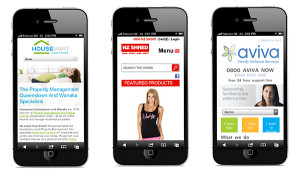
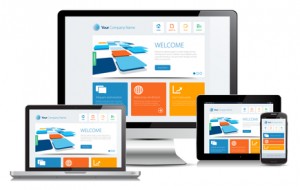
Responsive Design

Websites with responsive designs change or adjust their appearance of a website depending on the screen size. This is a crucial part of web design because more and more users are accessing websites through mobile devices such as smartphones and tablets.

Domain Name

Your domain name or simply domain is your website’s address, such as yourcompany.com. It’s unique to every website, although you can buy other domain names and direct those to your website. You can buy a domain name from any domain name company or registrar.

There are three different types of domain names: TLD or top-level domain (e.g., “.com”); country code TLD (e.g., “.co.nz”); and sponsored TLD (e.g. “.edu” or “.org”)

URL

The URL or uniform resource locator is the address of individual pages. If the domain name is the house, then the URLs are the different rooms. For example, https://www.yourcompany.com/about. The URL is composed of three parts: the protocol (http or https), the domain name, and the uniform resource identifier or URI (the part that comes after the TLD).

API

API stands for application programming interface. Essentially, it tells you what you can and can’t do within a website. APIs are used to integrate one website with another (for example, a social media site) or a software (for example, a payment gateway).

SSL

You’ll often hear SSL when discussing website security. It stands for secure sockets layer, which encrypts any information that passes through a network so third parties can’t “see” it. If you see a padlock icon on the address bar beside the URL, then that website is secure. The protocol part of the URL also indicates if the website uses SSL (it should be https).


When you understand common web jargon, building a website will be more pleasant rather than stressful. Hopefully, this guide has helped you achieve that goal. 

Posted in Website Design

5 Tips to Design Your Next Website Header

website design on desktop screens

The header is the first thing visitors see on your website. And unless they're on a landing page, it's present on every page of your site.

And because it contains your brand name, logo, and navigation options, the header has to make a great first impression. It has to be simple yet beautiful and functional. 

But don't worry, we're here to help you out. Here's the complete guide to design your next website header.

5 tips to design your next website header

1. Highlight the important elements

The header should contain the most important information about your business. That way, users can quickly decide if the website will satisfy their search query.

Your company's name and logo have to be present,  obviously. And depending on the type of business you own and your business goals, you'll have to consider adding a few of these elements:

  • Navigation Links
  • Search Button
  • Call to Action - Shop, Get a Quote, Make a Reservation, Call Us etc. 
  • Contact Information
  • Social Media Icons (Facebook, Instagram, YouTube, etc.)
  • Multi-language toggle (if necessary)
  • Headline

Take note that these elements will vary depending on the type website.

For example, if you run an eCommerce store, your header should include a shopping cart icon. If you own a restaurant, you should have a Menu option available to users. 

2. Make it readable

Although using dramatic fonts may look unique, a lot of users may find those fonts hard to read. Keep it simple and use a popular font family such as Helvetica, Calibri, or Arial.

Just as important as font style is font size. Too small and users will be forced to zoom in or squint at their device. Too large, and it will disrupt their browsing. 

Finally, keep your sentences short and simple. If a user cannot quickly read and scan for the information they're looking for, they're going to leave. 

3. Make it look great

A good-looking header should have a balance of color, navigation items, and space. You don't have to fit every icon, image, and navigation link into the header..

In fact, the simplest and cleanest options are the best-looking headers. Popular headers often include: 

  • A simple, easy to understand main menu
  • Sticky header that "sticks" to the top of the screen even as you scroll
  • Common design features such as layering and color contrast

4. Choose a practical design that's aligns with your company

There are several menu styles that can be incorporated into well-designed headers.

However, two of the most efficient options are expandable and double menus.

Expandable menus provide plenty of space for images while double menus present users with two layers of navigation. 

One of the most common menu styles seen on headers today is the hamburger menu. This expandable menu gets its name from its design, which consists of horizontal lines that make it look like a hamburger. Popular on mobile sites, the hamburger menu is easier to access and contains the website’s core pages.

However you choose to design the header, make sure it aligns with your company's personality. 

5. Design it with mobile users in mind

Your header may look beautiful on a desktop device, but how about a mobile device?

With more mobile users than desktop users (and Google's mobile-first indexing), your header needs to be designed with mobile users in mind. 

Again, think simply here. Less is more.

When users scroll down on their phone, they don't want to be distracted by a huge menu taking up half the screen. Design the header so that as users scroll, it shrinks and sticks to the top of their device. That way it still remains functional without distracting users from the content on your website.

And as with every feature of your website, test it out. See which designs & features are working and which ones are not. With enough tests, you'll eventually have the perfect header for your website. 


The header is an integral part of a website, so businesses should take the time to design a header that’s attractive and practical for users. To learn more about the importance of great header design and ideas, contact Activate Design today. 


Posted in Website Design

5 web design tips for startups in 2017

Web Design Tips graphic

2017 is shaping up to be a year of change and for start-ups, an excellent opportunity to launch a bold new website incorporating the latest design trends. So what website design features worked in 2016 and what can we expect to see more of in 2017?

Some of the more ‘out there’ website design trends include features like virtual reality in the browser (check out Magic Leap for a taste of things to come), Chatbots and AI-powered interfaces like Zo.

Here at Activate Design, we looked at what worked for us regarding web and graphic design from our own work in Christchurch and other design sites around the net. Focusing mainly on startups or new online businesses, we’ve picked five website design tips and techniques for startup websites that we think are both cool and (more importantly) will improve the user experience for your customers. A survey by Adobe found that 38% of people will stop engaging with a website if the content or layout is unattractive, so we not just talking window-dressing here, a good website design is crucial to customer engagement.

1. Minimalism

Minimalist design was big in 2016 and will continue in popularity for two good reasons:

  • It removes visual clutter and helps users to get things done more efficiently.
  • Websites with clean, simple interfaces that offer a cohesive mobile and desktop experience win big with users and customers.

Many sites are stripping back the extras and focusing on their content. This means fewer links, banners, etc. and more white space, which encourages scrolling and exploration. Simple sites load much faster, a vital feature for your site, as most users will abandon a website if it takes more than 2 seconds to load.

One feature of minimalism that hasn’t proved to be so successful is Flat Design, where links can be so subtle that users don’t know where to click and become confused. Semi-Flat Design (also known as Flat Design 2.0), introduces subtle shadows, highlights and layers that give users the necessary signifiers to navigate your site without frustration.

Related article: What are the Advantages and Disdavantages of Using Flat Design

2. Micro-interactions

Micro Interaction

Image credit: wikia.com

As Nick Babich from uxplanet.org describes them, micro-interactions are ‘subtle moments centred around accomplishing a single task’. These can be hovers, click animations, scrolling effects or many other simple techniques that improve UX. in 2017, more of these features will be incorporated into the mobile web, as screen sizes grow and customers expect to do more on their smartphones and tablets.

A good micro-interaction:

  • Provides feedback to the user
  • Gives them a sense of being in control
  • Encourages them to act (the call to action)


3. Landing Pages

 Landing Pages

Image credit: formstack.com

Homepages are so ‘last year’! Actually, home pages are still vital but more and more, the way to grow your business in the online space is through dedicated landing pages that form part of a unified content strategy. For a lean startup, this approach is particularly effective; you can use social media to generate interest in your company while avoiding the high costs associated with traditional advertising.

93% of online experiences begin with a search engine (Source ImForza.com), which means website visitors are not necessarily entering through the ‘front door’, so it pays to create SEO-optimised landing pages that deal more directly with the needs of your potential customers.


4. Animation

As the internet becomes more like television, moving visual elements such as animations, GIF’s and cinemagraphs can play a great role in conveying concepts and bringing your site to life. Simple animations load much quicker than video or high-res photos and offer startups a great visual tool to explain abstract concepts. A captivating animation or a cheeky Cinemagraph can also buy you valuable extra eyeball time and keep visitors on your site for longer.

Cinemagraphs are basically classy animated GIFs. They usually employ subtle movement that is appealing without the potential annoyance factor of GIFs. Check out these beautiful examples of Cinemagraphs here.

Animations used to be resource-hungry Flash creations, today, with Javascript and CSS coding, websites run much more smoothly. Animations needn’t be just gimmicks, they can be integral components which improve the user experience. For example, many websites use the shaking effect for login fields to indicate to the user that an incorrect action has been taken.

Related article: Effective Website Design

5. Credibility

Credibility Quote

Image credit: quotesgram.com

In this post-truth age, with fake news and an overload of information, credibility and trustworthiness are valuable assets. Website design can play a role in communicating these attributes. The renowned UX expert Jakob Nielsen offers the following advice to enhance website credibility:

  • Websites should have a professional look with clear navigation and no typos!
  • Be upfront. Disclose all relevant information, e.g. shipping charges.
  • Be comprehensive, correct and current. Any old photos or dead links will send users away.
  • Connect to other sites. Links to other third-party sites is a sign of confidence and standing.

At Activate Design, we proudly acknowledge our Christchurch based location as a Website and Graphic Design company. In this way, customers are reassured that there is a solid, bricks and mortar company behind it all (well, steel and glass in our case!).

It's important to remember that while website design can evolve rapidly from year to year, the online habits of users change very slowly and we need to accommodate their needs by keeping to good human-centred design principles.

So there you go, five website design tips to incorporate into your next website. If you’d like more information on any of these design tips, give us a call or email us. Stay tuned for next month’s blog post where we look at the best internet marketing strategies for small businesses in 2017.


Sign up to a weekly Small Business Marketing Master Class to learn more actionable strategies to help your business.

Posted in Website Design

Infinite scrolling website design

Infinite scrolling is a web design trend that is making waves in todays website landscape. It is simply the ability of a page to infinitely produce more content so that the user can scroll down the page uninterrupted. No more clicking. If you’re a social media buff or a Pinterest personality you will have come across this tool, perhaps without even noticing.

A technology that has grown from the increasing amount of tablet and smartphone users, infinite scrolling provides an easier way to navigate through websites on all devices. It has even progressed to being used as a complete navigation system in websites dubbed as infinite scrolling websites. It is fabulous for some websites but has suffered some teething problems with others. Though it appears simplistic and sleek, endless scrolling can result in confusion and frustration for users when applied inappropriately to websites.

To start with the positives, infinite scrolling can be a powerful tool that when executed well can expose users to more content and improve their experience. Infinite scrolling is hugely effective on websites that specialise in low engagement content (content that does not require active engagement or encourage interaction). Social media sites benefit hugely from this technology because as a rule, the content is taken at face value and every piece of content has the potential to be interesting to the user, meaning that scrolling through a lot of content is not a problem. It provides a more efficient and intuitive way to navigate through a ton of content that requires little action. When done well, the user experiences a truly responsive website that caters for their needs seamlessly.

However, for other sites that require the user to actively engage in their content, to click a button and interact with it, infinite scrolling can cause problems. The endless amount of content can overwhelm users and decrease the value of each piece of content. This can then inhibit user engagement and take away from what the website has to offer.

Infinite scrolling is seen to take the control away from the user, something that is an instinctive need for humans. With the alternative, a user has a defined amount of pages to search and can pick and choose when they have seen enough. With infinite scrolling, the user has no idea when the content is going to run out, or how relevant it is to them and requires the user to simply continue scrolling. If you leave a website feeling that it wasted your time you are unlikely to have a positive response to it.

This is where we are faced with a problem; how do you balance usability on devices, expose the user to more content, and keep them actively engaged? A good compromise is hybrid technology that relinquishes control to the user, yet allows them to scroll through websites using any device, with ease. To achieve a hybrid website all that is required is to predefine the number of pages before a prompt appears asking the user if they would like to see more content. It’s as simple as that to give back control to the user and maintain a consistent data load on the server.

Whether you choose to make a full-blown infinite scrolling website or a hybrid, there are a few things that can help make this tool more effective.

To ensure that the website is seamlessly infinite, Lazy Load content ahead of the user. However, despite the use of this technology, you can’t help when some users skip ahead faster than the preloaded content. In this situation it is essential to provide the user with a visual cue to tell them more content is loading. This way you can keep the user in the loop, letting them know that the site is still working and deter them from leaving. Although this ‘loading’ cue is necessary, it should hardly ever be seen.

The largest issues with infinite scrolling are down to navigational ease. Problems arise when the user navigates away from the infinite scrolling page. Often they will lose their place and when they return the site bumps the user back to the start. This is extremely annoying and can be enough to turn away users from your site as they are forced to spend time scrolling their way back. To remedy this problem, make sure you keep back button functionality so that the user can redirect themselves to the correct spot with just a click of a button. This is also useful to help the user maintain a sense of perspective and control, two things that are important to achieve in order for the website to be comfortable and intuitive to use.  An alternative is to program content to open in a new window when clicked. This option has been the cause of much debate as it is said to take control away from the user, and can also cause discomfort on smaller devices.

Infinite scrolling websites can lose their basic navigation systems all together which makes it very hard for a user to access the different regions of the site. The navigational bar is often lost as the user scrolls down the page, and the footer can never be found because of the constant stream of content being uploaded. Making sure the navigation bar at the top of the website is maintained despite scrolling down the page is wise, the user can then make their way to another part of the website without having to scroll all the way back to the top of the page. Having a footer, and being able to access it, is extremely important as it is there to provide important information about the site. The footer is often the last resort for a user to locate a specific topic. If the user can’t find the footer then they are likely to give up and discontinue using the website. A hybrid website can be the solution to this problem, as the prompt and footer can appear simultaneously, giving the user a chance to utilise it.

Lastly make sure you filter, filter, filter. Program the most relevant content to appear at the top of the page. Then hopefully, the user will be able to recognise when content becomes less relevant and can stop scrolling. This gives them the control over the amount of content they are exposed to. It’s best to try not to waste the users time as it will cause them to avoid using your website in the future.

This trend is growing and with more insights on how to use endless scrolling technology to its best advantage, it can only continue to become more effective. To see some examples of successful infinite scrolling websites, click here.

Posted in Website Design, Web Design Trends

How responsive web design can help your business

responsive web designThe amount of websites that utilise responsive web design is growing with the increasing amount of devices people can access the web from. We want to tell you all about responsive web design so that your website doesn’t get left behind in the dust of this rapidly adopted web designtrend. With people using laptops, tablets, smartphones and varying sized desktop screens, it is important to ensure that your website responds to the technology it is accessed from. A non-responsive website sticks out like a sore thumb in the quickly evolving web-world.

Responsive web design is simply the ability of a website to change its format to correspond to the device it is accessed from. On a more complicated level the tool can enable web designers to provide different content for different users; for example, by accessing the user location a website can tailor information to them on a geographical basis.

The growth in smart phones means that more often people are using websites on smaller screens and if the website is non-responsive it makes navigation around said website extremely difficult. For example; a traditional fixed width screen can cause a user to have to scroll horizontally to view content that was intended to be seen at first sight. If you can believe it, the current attention span for humans using the web is now less than a goldfish; meaning webpages must be both engaging and easy to use to be effective . A non-responsive, ill-fitting format will cause frustration and repel many users, meaning that the crucial messages websites need to transmit to users are not received.

If you don’t believe us, check out your websites stats on Google analytics; you can find out how many users are accessing your website via their cell phones by selecting the ‘Audience’ option, then ‘Mobile’. The time is now to change your website design as the amount of people accessing the web from different devices is only going to increase in this technology driven world.

The good news is, transforming your website into a responsive design is not as complicated as it sounds! There are two options for implementing responsive web design; creating an adaptive website with multiple fixed width layouts set for common devices, or, using multiple fluid grid layouts to achieve a truly responsive user experience. Most web designers will use fixed width layouts if they want more control over how the website will look on different screen sizes, however, this approach does not respond to change in browser size - a common practice of web-users who want to view multiple browser windows at the same time. Fluid grid layouts work on the basis of proportions rather than pixels and the content changes according to browser size. Web content is given a percentage of the browser or screen to take up; as the size of the viewing window changes the content continues to take up it’s assigned percentage of the browser responding to it’s viewing environment. You can even utilise both concepts with a mixed approach to responsive design; having some fixed width layouts for certain devices and some fluid grid layouts for others.

In implementing responsive design there are a few things to think about. The first is that graphics can cause a website to be slower to load on certain devices, so when designing a web-platform to be accessed from cell-phones or tablets with lower capability, it might be wiser to remove or downsize on images, graphics and advertisements. The popularity of touch screens means that there are now two navigation routes to consider; touch and mouse. What may work well for the click of a mouse could be a nightmare for somebody with not-so dainty digits.

It’s that simple, and with the populations’ increasing reliance on technology and high-speed culture, being able to access the information you need, on the go, is a luxury many aren’t willing to live without. The integration of laptops, tablets and smartphones into everyday life has made Responsive Design a necessity for websites that want universal exposure.

Now you may be thinking all this talk of cell-phone and tablet usage means that you should be thinking about creating an application, and this is indeed something to consider. Our take on this decision is that a responsive website may be the better option in terms of universal compatibility. This is because the application world is fickle; often certain brands will only work with apps from certain platforms. With the iOS and android faceoff going down, to allow both apple and android users access to your app, double the work may be required. Having a responsive website guarantees that all devices that have access to the Internet will be able to use your site. Wonderful! No more taking sides.

While vamping up your website it might be a good idea to consider including some other current web design trends. Long scrolling is the new thing in website navigation; the effort exerted through clicking can sometimes be too much! Websites that take the user on an intuitive narrative journey through scrolling; up, down and side-to-side are sought after and savvy. Where the bold and bright colours may have been hip and eye catching yesterday tomorrows request is light and subtle hues. With so much time spent staring at a screen nowadays it can be nice to find yourself looking at a website that is not an assault on the senses. Lastly to get personality into a website and make meaningful connections add simple animations - you might even make somebody laugh!

Responsive web design is a win-win tool as it means ease of use for users and better communication from website beneficiaries.

Posted in Responsive Design, Website Design

Top Web Design Practices in 2015

Are you as excited as we are? We’ve scoured the web for the best web design trends that will be transforming the internet in 2015. Some of them you may have heard of already, like responsive design. Others just might blow your mind. Either way, the future looks bright and we’re excited to be a part of it.

Responsive Respect: responsive website design

I don’t want to sound like a broken record here, but if responsive design isn’t the future then I don’t know what is. Have a look around you on a given day. People are on their smart phones, iPhones, tablets and iPads all the time. The future is in mobile friendly design. In the last few years responsive design has secured itself as the new standard for web design to the point where it has ceased to be a trend and can now just be considered the norm. If you’re not on board then you’re very behind.

Who Ya Gonna Call?...

…Ghost Buttons! Ghost buttons are a prominent design feature in many web designs and it’s no wonder. These buttons are not only minimalist and stylish but they’re a blast to use. Hover animation?! Yes please. As they pair well with the bold and beautiful backgrounds that we’ll see popping up over the next year, these ghosties are something to keep your eye on and to get acquainted with.

We’re Bringin’ Sexy Back

It’s one thing to have hot content, another to present it beautifully. In 2015, there’s going to be a bigger focus on typography. Web kits for type are notoriously expensive until now. Type kits are becoming more affordable or sometimes even FREE with Google Fonts. This means there’s a lot more freedom for designers working with smaller budgets to bring their mad typography skills to overflowing and ever-competitive the web design table. This also means that WordPress theme designers will focus on making stylish type-centric design possible for anyone with a well-designed WordPress theme. Whoop!

Pretty Hurts:

Savvy web designers will be saying a lot with big, bold and beautiful background images and videos. It’s one of the easiest ways to make your site stand out so make sure you’re featuring excellently written content against a powerful image. This future trend is an elegant way to strengthen your brand/style/philosophy.

Scrolling with da homies:

Scrolling is imperative to a positive user experience on the web, so say goodbye to clicking. Scrolling allows a more dynamic interaction to occur between users and websites. It’s more intuitive and really, it’s just easier to use for navigation. You’ll be seeing a lot more of it in the future.

Hey Flatty

Aw! Look who’s growing up! Flat design is being touted as Google’s new direction for mobile design and everything else really. Only they’re calling it ‘Material Design’. Let’s have a quick look at the main principles:

1. Material is the metaphor: The first principle is an attempt to ground our digital experience in tactile reality. The material metaphor is moving away from skeuomorphism while embracing ink, paper, shadows, and depth. Material Design will reinvent and reimagine objects that exist in the physical world without breaking the laws of physics.

2. Bold, graphic, intentional: The second principle deals with print design. Visual elements can’t just look pretty, they have to create meaning. Material Design emphasizes deliberate colour choices, large typography (yes!), and the intentional use of white space to create an ideal user experience.

3. Motional provides meaning: The third principle of Material Design emphasizes the movement. Motion needs to provide visual feedback without being distracting. It feels authentic and needs to respect the physical reality of mass and weight. Objects will use swift acceleration and gentle deceleration to provide the user with a believable sense of motion.

Material Design is a mostly flat design that uses very subtle gradients, layering, and animation to retain a sense of the tangible world while still achieving all the advantages of flat design. Sounds amazing to me.

Think Micro not Macro

Good things come in small packages.  So, what are these micro-interactions that so many people are talking about? They’re pretty cool: Micro-interactions are contained experiences or moments within a module on a website that revolve around a single use basis. For example, take the email sign-up box that pops up on a website. It’s moving which gives it a playful personality to a graphic that would otherwise be static and maybe a little boring. Micro-interactions like this serve to increase user engagement.

Tell Me a Story

The combination of everything I’ve mentioned so far has one collective goal: Creating a better platform for telling compelling stories and narratives. I’m not saying that every web site should have a story, but a brand is constructed from a series of values and everything from font choice to web copy embodies this. You’ve heard it before: Content is King. There’s a reason why this saying is constantly thrown around on the Internet. People are smarter and busier. They don’t have the time to sit around on a website that has boring content. If you can create a story using well written content combined with incredible images and design elements, you can be sure your website will stand out. Getting noticed is the game. So get amongst it.

It’s a Wrap

One of the best things about being a web designer is how fast things move. To be excellent in this game, you’ve got to be willing to adapt. When we look at future trends, we get excited for several reasons. One, it’s pretty fun trying out new techniques. Two, it’s great to be learning new tricks on the job. But most importantly, it makes us better designers. We’re pretty lucky to have a fluid arsenal of web design theories and skills: they allow us to create anything. Our only limitations are ourselves. If you’re interested in applying any of these new web design features to your current site, get in touch. We’re excited to put the future to use.


Posted in Website Design

responsive web design for future business

The late/great Albert Einstein once said “I never think about the future, it comes soon enough.” True enough for some, Al, but when it comes to web design and business, we think it’s smart and necessary to think about the future in order to succeed. As we all know, change happens fast, and in the worlds of web design, business and technology, it happens even faster. To be good web designers and business operators, we need to stay on trend and stay current. To be excellent at what we do, it’s necessary to identify trends before they hit.  mobile web designs

With the advance in mobile technology in the last few years, it’s no surprise that more and more people are using their mobile devices to access the Internet. How is it then that the vast majority of businesses are still not mobile user-friendly? Can I be frank? If you’re a business owner and you don’t have an online presence that is accessible via mobile you’re missing out on major business opportunities. There’s nothing complex about having a mobile presence. The answer is so simple:Responsive Web Design. So, what is it exactly?

Responsive web design is a web design style that crafts websites with the aim of providing an optimal viewing experience. These websites are easy to read and even easier to navigate across a wide range of devices by being coded in a way that uses a minimum of resizing, panning and scrolling, thus making it a very user-friendly style. Happy users are happy customers and happy customers spend more money. This is what we call conversion. So, how do you get the most out of your responsive design?

Ring! Ring!

When it comes to creating a mobile website, you have two options: Responsive Design and Mobile Templates. Responsive design is easier in that it requires only one website that is coded in order to adapt to all screen sizes and therefore accessible through multiple devices. Mobile templates aren’t as friendly. They require an entirely separate mobile-only website. You can see why this is a problem! It’s more work, more money and more hassle.

Consider this:

  • More people are using their mobiles for Google searches
  • 25% of Internet users access it on a mobile device
  • 25% of all emails are opened on mobile phones
  • 61% of people have a better opinion of brands when they offer a good mobile experience

Keeping customers happy is paramount to a successful business so providing a positive user experience should be a top priority. If someone lands on your mobile website and doesn’t find what they’re looking for easily they’re likely to leave your site for your competitor. A positive experience on mobile devices can translate into more profits as the customer is 67% more likely to purchase your services or products if it’s fast and easy to do so.

Keeping Google Happy

It’s a well-known fact that Google prefers responsive web design over mobile templates. Just like your customers, Google wants to be able to navigate your site and organise the content with ease. With responsive design your site has one URL and the same HTML across any device making it easier for users to share and engage with the content compared to sites with different pages for mobile and desktop users. Google knows that unhappy customers will go to other sites which then results in an increase in bounce rates and lower ranking on mobile searches. Beware: Google’s external link algorithm then gets cranky and this can have serious consequences for your SEO.

Back to the Future

One of the best characteristics of responsive design is that the size of the template is designed based on screen size and not specific devices. Technology is in a state of flux at all times. New devices are dreamed up and created faster than you can say “Eight Track Player”. Your responsive website won’t be made obsolete with the advent of new technology. It will stay current and beautiful which saves you money because you won’t need to tweak it. Speaking of money…

Responsive Design: How Much Does It Cost?

Depending on your current website, changing it to a responsive design may cost a few hundred dollars or a few thousand. That’s assuming the existing design lends itself to becoming responsive. If you haven’t redesigned your website in the last several years it’s quite probable that you’ll need to go through a complete redesign process. As designers we know that the cost depends on how much work you want to get done.  If you’re interested in converting your existing site to responsive design, we can help. Just get in touch with one of our designers and they can talk you through the process. If you’re looking to stay competitive in the marketplace, you’re going to have to make the leap to responsive design.

Call me: The Future Is Mobile

Going ‘responsive’ can present challenges for website owners but without a mobile-friendly website the future of your online presence is bleak. If you’re not providing a mobile-friendly experience for your customers, they’ll bounce off your website and go to your competitor whose website is easier to use. Haven’t you ever done that before yourself? I know I have. The future, as we all know, is mobile. People prefer their mobile devices over desktop and laptop computers. Consider this fun fact: by 2017 5 billion people will use mobile phones. Can you afford to stay in the Dark Ages of web design? Nope.

There are, however, some exceptions to the rule:

  1. Your business doesn’t depend on your website to operate. (Lucky you!)
  2. Your business has absolutely no competitors in the marketplace. (Um, really?!)
  3. You’re totally familiar with responsive design, you know that it’s not the right fit for your business and you have an alternative mobile strategy. (Fair enough.)

If any of these 3 points resonate with you, then you have nothing to worry about. If not, get in touch. We’re here and we’re ready to update your website to be responsive. Welcome to the future.


Posted in Responsive Design, Website Design

Top Trending Website Design Inspirations

As professional web designers and developers, you’re visiting probably well over a thousand websites a month in order to stay up to date with trendy design and to generate ideas for your own projects. With the design landscape changing so frequently and fast, how do we stay current, and more importantly, how do we stay motivated to create the best websites possible? Better yet, how do we find the time?!

Web design is the so hot right now and the web is constantly expanding, growing and flourishing. This is due to the fact that people are genuinely interested in getting involved with the development of the web. And this makes us…happy. That’s right, we’re happy that the web is growing and evolving at a rapid rate because it means that we’re Responsive Website Design
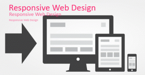
constantly seeing new design trends. We’re hoping that this will eventually result in a web that is based solely on excellent design rather than just function or purpose. The revolution may not happen yet, but we believe it’s in the works…

We’re been trawling the web looking for the most inspiring design trends so you won’t have to! Have a look, take some notes and get ready to revamp your web design style!

  1. Keep on Scrolling: When you combine storytelling with user experience it often gets you a long page narrative. Websites will keep on experimenting with this more and more in the future. Clicking is so early 2000. This new scrolling is called long scrolling and it means is that all of your website’s pages can be viewed by vertically scrolling up or down. Boom. Easy. People have less and less time these days and getting lost navigating your pages is the last thing they want to do. One page websites are the new things. Keep an eye out for parallax scrolling too, which is a special scrolling technique where the background images move by the camera slower than foreground images, thus creating an illusion of depth and adding to the immersion experience.
  2. Make it Personal: People don’t want their only reactions to be with machines. Writing personal content is the best way to make your customers trust you. Good content is the only way for you to connect with your online audience, so write it like a human would, not a Cyborg. It’s no big secret that people perceive and process information easier when it’s delivered with graphic aids. Big content blocks are also great both for responsive web design and storytelling. The blocks focus readers’ attention on one statement at a time and become even more powerful when combined with bold web fonts, lots of whitespace, separated with colours, and matched with strong images.
  3. Responsive Design!: This web design approach is aimed at crafting sites to provide an optimal viewing experience for customers. The easy reading, navigation, panning, and scrolling across a wide range of devices like mobile phones to desktop computer monitors is quickly becoming the standard for business, and if you don’t comply, your Google ranking is going to suffer. Responsive design makes set website design look archaic.  Get on board if you want to stay up to date.
  4. Simple Design!: Simple design is a misnomer. It’s not implying that it’s easy to do, but rather it refers to the use of the best practices so site visitors get what they need without complication. Simple design embraces powerful images and meaningful content. It showcases purposeful navigation. Remember that ol’ saying: Keep It Simple, Stupid. This applies to the following:
  • Simple Animations: The one other trend that has taken off after the release of iOS7 is the use of simple animations. These are subtle animations that give affordance and personality to the design that you see on websites and apps. You can see it in gestures, for example when you move up and down the chat bubbles in Messages where the bubbles bump against one another.
  • Simple Colours: Over the last year, bold and bright colours have been making a name for themselves but light and subtle colour combinations are on trend now.

Psst…Pantone colours to watch out for:

Placid Blue: This is the ultimate light blue pastel shade. Associated with peace and serenity, this dreamy blue goes well with any pastel shades and classic bolds.

Violet Tulip: If you haven’t guessed by the name, this is a lavender shade. It’s a very romantic and vintage hue that pairs well with bolds.

Hemlock: This is a light green, almost pistachio, with a hint of the orient. It differs much from the trendy mint and emerald hues with its tenderness. All three of these shades perfectly combine with each other and with brighter colours.

  1. Tell Me a Story: Storytelling Design is similar to writing good content but I want to take it further. Storytelling design tells a story through concise, compelling copy coupled with strong imagery as users scroll down the page. It’s the best way companies can get their customers to connect with them. You’re telling a brand story now! You’re not just creating a website that brags how great your services are. The marketplace is saturated with businesses just like yours. But your story can make you stand out. So tell it well.
  2. Hey Flatty: Flat UI is a mix of fun and smooth colours, combined with complete and total simplicity, which brings websites and web applications to life. Giants like Apple and Microsoft are getting on board, so it’s time for you to embrace it too. Flat design focuses on simplicity and clarity and helps websites get rid of their excess clutter. Users can then focus on the content and overall the user experience becomes more enjoyable. Flat UI just going to keep growing so take the time to study it.
  3. Video Killed the Radio Star: There are only so many great copy writers out there and you don’t want your customers reading all day. Change things up by creating videos that get your message across. You can get creative and even cheeky with video. The right videos can go viral, so it’s worth considering if you’re looking for potential word of mouth advertising. Video content is becoming easier and cheaper to produce and crisp HD photos can easily make your website look professional, attractive while getting your message across. We’re social animals and there’s no better tool than a good video for storytelling. Videos can stir our emotions and create a closer connection better than just well written text. Watching a video can entice your users to linger longer on your page, thus allowing them to get to know your brand better.
  4. Don’t Believe the Type: Make a name for your brand with personalised fonts. Fonts have evolved in the last few years, with services like Google Fonts offering hundreds of free fonts to choose from. There is a definite potential to create something more memorable with branded fonts to get your message across. The websites using these fonts say that they’re independent, trailblazing and downright sassy.  It’s a strong message that works. In addition to this, big chunky font is trending.
  5. Take a Ride: Fixed Navigation is the new way to go. Websites that integrate social media, search and even purchase options within their fixed ‘navbars’ make the user experience more accessible and continuous. We’ll be seeing plenty of changes in this area in the years to come. The main purpose of the fixed technique is to keep the navigation bar constantly visible for the users as they scroll down which makes it easier for them and makes the experience more enjoyable.  Stripped-down navigation is a trend that looks set to grow in popularity and we’re going to see a lot more focus on icons, roll-downs, and navigation that shrinks as you start to scroll down the page.
  6. Blurred Lines: Since the release of iOS 7 last summer, designers have been using blurred backgrounds as a source of inspiration like crazy. You essentially overlay interfaces, creating a “shower door” type look with these multiple blurred backgrounds. It actually creates pretty attractive nonlinear gradients which can make your website stand out.

And there you have it, some of the best trends coming your way in 2014. Just remember that a decent design should serve both practical and aesthetic purposes. The best design comes from designing for the user’s needs by applying best practices. Don’t follow trends for the sake of it – if you don’t like a certain trend then use a different technique that suits your style.

Now, if we could just a drumroll so we can say a proper goodbye to the following trends that have assaulted our eyes for too long…

  • Overused stock photos
  • Auto-play videos and music
  • Automated popups
  • Advertising sidebars
  • Inane blog posts
  • Loading and Reloading pages
  • Modal windows with hidden or tiny close commands
  • Small, impossible to read font sizes
  • Long shadows: why?! WHY?!!
  • Hipster icons and logos

Goodbye and good riddance!

Posted in Website Design, Graphic Design, Web Design Trends

Flat Design: History, Advantages, Disadvantages.

In early web design, designers wanted to showcase their skills with vivid animations, three-dimensional graphics, and more. Then came skeuomorphic design, a design type which aimed to mimic real life with shadows, textures, and more. 

And most recently, flat design has become the leading technique for web designers. 

What is Flat Web Design?

flat website design style

Flat design is a UI technique that uses two-dimensional elements and bright colours. This means stylistic characters like drop shadows, gradients and textures are removed so that they lose the three-dimensional element. 

Flat design is commonly characterized by clean edges, solid colours, engaging palettes, flat/two-dimensional images and multi-browser compatible icons and fonts. It is meant to be minimalistic; and if a component of the design serves no functional purpose, then it is often discarded.

What are the Advantages of Flat Web Design?

Originally developed for responsive design, flat design enables web content to scale according to the user’s screen size. And with less graphical content, this technique allows the scaling process to occur faster, thus allowing the webpage to load faster. 

By removing older design styles that can quickly phase out of style, modern web designers are essentially future-proofing their designs to align with modern principles and ensure their websites continue to provide a positive user experience. 

What are the Disadvantages of Flat Web Design?

As with any trend, especially in the world of design, there are downfalls of modern trends. For one, it’s trendy. Many designers like to approach websites with their own style that does not conform to trends. 

In terms of stylistic principles, there are a few disadvantages to flat design. The first is colour. The use of bright colours often makes it difficult to match colours. 

Another issue is typography. If a font that is too slim or narrow is chosen, it may be difficult for users to read. 

And though flat design was intended to be minimalistic, many critics argue that it’s too simple. They suggest that it’s impossible to send complicated, sometimes underlying, messages in flat designs. Essentially, they’re implying that flat design limits creativity. 

With a better understanding of what flat design is, the history of it’s evolution may seem clearer. 

Creation Myth: Where Did Flat Design Come From?

Most of what we see on the web has origins from fine art. While it may be difficult to determine the exact start of flat design or where it came from exactly, we can look at a few periods of design and art that flat design takes inspiration from.

Swiss Style of Design

The Swiss style of design, also known as the International Typographic Style, is the main period of design that comes to mind when considering the history of flat design. This minimalist style was dominant throughout the 1940s and 1950s and mainly focused on the use of grids, sans-serif typography, and the clean hierarchy of content and layout.

Typography was a major element in Swiss design and soon our much loved Helvetica typeface was created in Switzerland in 1957. Thank you Switzerland!

Minimalist Design

Flat design has also been influenced by Minimalism. The term “minimalism” is sometimes used interchangeably with today’s flat design, but minimalism was a popular art technique decades before the web was developed. Minimalism has history in architecture, visual art, whereas flat design takes its influence from the design and visual art expressions of minimalism. Minimalism embraces efficiency. When you employ a minimalist aesthetic, you leave just the necessary elements. Geometric shapes, bright colours, and clean lines dominate both old and modern minimalism style design.

Who’s Your Daddy?

Microsoft and Apple have had the most impact on making flat design popular in the last decade. While Microsoft was working on its flat design style, Apple was working on something similar. Apple started hinting at moving away from its use of skeuomorphism, and then completely abandoned it in favour of flat design with the release of iOS 7 in the summer of 2013. The design of iOS 7 seemed to have made the flat design even more popular than it was before practically overnight.

Apple carries a lot of clouts when it comes to trendsetting styles and people tend to follow its design aesthetic because it feels more modern and on trend. So when Apple switched to flat design everything else seemed outdated and people began to redesign with this new, flatter design. This is most evident in the different apps that have been updated to work well with iOS 7.

Ring! Ring! Hello Responsive Design!

It’s important to note that the main reason flat design has become so popular in recent years is because of the development of responsive web design. As more and more devices are connecting to the web, with various screen sizes and browser restrictions, designers are finding that their tried-and-true design styles don’t translate as well when you have to shrink those designs into smaller viewports.

Flat design allows for the efficient web. Without the extra design elements in the way, clutter up space, websites can load much faster and are easier to resize to smartphones and tablets. It’s much easier to display crisp boxes and typography than it is to make several different images to accommodate all the various devices and features out there.

Back to The Future… of Flat Design

Considering how fast the web changes these days, it’s easy to say that flat design will eventually run its course in due time. It’s not the perfect design and there are obvious flaws. But as designers experiment, test, and learn, flat design will evolve and eventually a new style will emerge in its wake. Perhaps it’s just a matter of being able to incorporate it with other styles the way Google does. They take the best of both worlds…hmmm!

While the flat design may seem new and exciting and is a popular trend, it isn’t revolutionising the web. Flat website design creates a dividing line between technology and tactile objects encouraging a user-friendly and functional approach to ‘design’, with an emphasis on ease of operation. It makes surfing the web via your smartphone and tablet easier, but it’s nothing groundbreaking, is it?! Well, its user-centric foundations have seen it replace the old-school skeuomorphic design with a more simplified, universally recognised aesthetic.

Flat design empowers the UI of all modern Apple, Android and Windows devices. To adopt its approaches is to inherit its reach. It’s a style consumers expect and trust these days, and its introduction within the framework of your website could be the difference between online success & failure.

Flat UI designs, using brighter colours and flat visual effects with negligible or even nil gradients and graphical illustration, became popular because of the outrageous demand of something new and minimalistic. They follow a minimalist, responsive approach that is user-friendly, eye-catching, and works on any kind of website that exists.

Lost and Found

Have I lost you yet? This is a lot of information, but I’m going to give you some links to some more. There are plenty of resources out there that can help you better understand flat design and can advise you on how to use it on your own personal and professional projects.

There are literally hundreds of other websites that will offer you all kinds of flat design UI kits. If a flat design isn’t your aesthetic, then don’t adopt it as your design mantra. There are ways for you to stay true to your natural style and incorporate elements of flat design in order to stay up to date and contemporary.

The beauty of the flat design is that it’s clear-cut and clean. The sharpness and varied features result in a design that’s modern and tidy. If it’s too simple it may be unable to put across a complex visual communication. Some experts feel that this simplicity may be a disadvantage, but who can say for sure? At the end of the day, good design is all about usability and functionality. No one design can fit all websites and it’s up to you what kind of style you want to embrace. Right now, flat design is in fashion, so we feel it’s best to stay current and keep up with the trend.


Posted in Website Design, Graphic Design, Responsive Design

How Do Graduates In Web Design Get A Job

Mo’ Money: How do Graduates of Web Design Actually Get Paid?

Hey smarty pants, you’ve just graduated college and you’re ready to enter the real world and start earning some even ‘realer’ cash. How will you find a job? Some methods are better than others, especially when in the design industry. Conducting proper research ishire us hand written sign essential when it comes to job hunting for designers, as is the knowledge of how to create a good resume and portfolio. Here are some handy hints to help you secure a job quickly and hopefully with as little stress as possible.

You’re lacking in experience, but don’t let this hold you back. These days, all your skills are transferable: you just need to be able to communicate this effectively. What skills did you learn at that café that can be carried over to your new design career? If you’ve had any leadership or team-driven positions, it can look great on your resume, even if you were just a team leader at your local Mitre 10.

If you still have gaping holes in your resume, go into more detail about the particular courses you took at school. Be sure to highlight your academic successes, projects you completed, awards you won, and any travel you’ve done. Potential employers want to engage with your human side, so showcase your personality, not just your work experience and education.

You Are the Brand

In order to land your creative design dream-job, you’ve got to have a solid portfolio that demonstrates the high quality of design creativity you possess. Your resume and portfolio are essentially advertisements for your brand, which is YOU.

You can’t just send out mass emails with the same resume to every potential employer. You should tailor your resume and portfolio to each prospective employer, studying their design work and tailoring your content to reflect what it is they may be looking for. You’re clever, you’re talented and you need to prove it.

It’s the Little Things that Count

Reading full job descriptions and following the instructions exactly is imperative when applying for your first web design job. Employers do this to weed out the people who don’t follow instructions properly. Don’t wait for them to ask for a link to your portfolio, supply it immediately. If you don’t follow these precise instructions, you’re running the risk of being auto-deleted. Keep in mind that there may be hundreds of other designers vying for the same job, designers who may be more qualified than you. Give yourself at least a chance to be considered by not makings silly, avoidable, and embarrassing mistakes.

Web design job descriptions can be very vague and some terms can be misinterpreted for a completely different position. Front-end development, HTML, and CSS are all very different things and you may not know them all inside-out. Understanding what skills are appropriate for the job you’re applying for is very important. Time is money and you don’t want to waste it. That said, even if you don’t have all of the proper qualification, there’s no harm in taking a leap and applying for a position that is beyond your skill set. If your personality is spot-on and you’ve got the right attitude, a company just may take you on board with the intention of training you up properly and reaping the rewards with years of commitment.

Trade Me Jobs vs. Everything Else

The only place to start looking for a job is Trade Me Jobs, right? While it’s convenient to have Trade Me at your fingertips on your mobile or laptop, make sure you’re thinking out of the box. Yes, most businesses advertise on Trade Me first, but while there are oodles of jobs available, there are also hundreds of applicants pursuing the same position. Be sure to check out SEEK and be so bold as to check out the websites of the design firms and companies that you admire. Sometimes they may post listings on their sites. Check frequently. Even if you don’t hear a response back right away, some agencies will keep your information on file and contact you later on when they’re looking for someone. It’s an excellent idea to make yourself known to the agencies in your city, even if they don’t seem to be actively looking for a designer.

It’s a Popularity Contest

Using social media platforms as a medium to connect with others is a great way to create and develop professional relationships. Many designers hear about jobs through friends before a position has even been advertised publicly. Keep your mind and options open by seeing potential in everyone that you meet online and offline. New Zealand is small and you never know who you might meet and what opportunities they can provide for you. Start building up your personal network and don’t be afraid to ask if your fellow designers know of any jobs available. Your best chance of landing a design position may be through the personal connections you make.

Use Your Brains

Finding the right job after graduating may take several weeks to several months and that’s why you’ve got to keep track of the agencies you’ve already contacted and who you should follow up with. Create a simple Google Doc with a chart of the company name and a brief description, the name of your primary contact for the job and the date that you applied. This will help you see your job hunting progress all in one place, instead of your e-mail inbox.

If you’re not hearing back from any of the companies you’ve applied to, it may be time to try a different approach with your resume and portfolio and see if you get any better results. If you haven’t heard back from a company within a week, sending a polite follow-up note to remind them about your application is good way to proceed. But, don’t be too aggressive as they might just be overwhelmed with too many applications.

If you haven’t heard back in a month’s time, don’t barrage them with e-mails. Instead, put that lead on hold for now and pursue some others. Certain companies are too busy to let you know whether or not you’ve made it to the next round in the application process. Don’t take it personally and don’t get discouraged. You need to be pro-active. You make your own opportunities!

Let’s Break It Down:

  1. When it comes to your resume and portfolio, create something that will get a Creative Director to really notice you. It’s all about impact. You’re a brand and you need to be remembered. Create a portfolio that defines what you stand for. Create a talking point about you. Don’t let the fact that you stay less than a year at any given job be the only talking point. If you’ve moved around too much, be ready to answer some tough questions about reliability and commitment.

  1. So, you’re a brand and not the Ultimate God of Design. Let your work speak for you.  Don’t tell your potential employers how amazing you are. Remember, you just graduated, so while you’re fresh, you’ve also inexperienced and you don’t want to come off looking arrogant and deluded. The design firm that hires you is doing it because you’re cheap, you work hard, and you’re showcasing your potential.

  1. With so many books the same, your portfolio needs to be different. A lot of design schools churn out factory farmed students with the same work. It takes Creative Directors less than 15 seconds to determine whether a portfolio warrants further inspection. Great agencies look for a certain amount of professionalism and depth. If you really want to stand out, your portfolio needs to be stunning.

  1. Be ready to work hard. Studying graphic design is a luxury and while you’ve been doing work and learning over the last few years, there hasn’t been much pressure. You’re entering the real world now and you need to work harder, faster, and all-hours. You need an excellent sense of time management and you need to have a good sense of process. How do you approach your work? Where do you go for inspiration? How do you know when an idea is good?

  1. At the heart of it all, people are the most important assets in any design firm. You need to be able to engage future employees with your kindness, your attention and your eagerness to learn. Don’t go into an interview cocky and arrogant: you need them more than they need you. Employers are scrutinising your portfolio, resume AND your personality. Are you easy to get along with? Can you work efficiently with others and independently? You don’t need to be the best of friends with your work colleagues, but you need to be able to maintain an open and healthy dialogue. Good web designers are thoughtful, considerate, and not overly wrapped up in their own egos. Our designers at Activate embody all of this and more.


Posted in Graphic Design, Website Design

Recent articles

Categories