Let's get started!

preferred reply

Logo Footer

Office: 205 Durham Street (top floor)
Christchurch CBD 8011
PO Box 3871, Christchurch, NZ

Enquiries: 0800 30 8996
(03) 964 5305 - Reception
[email protected]

Web Support:
(03) 961 1106 - Support
[email protected]

Socials

Facebook X Instagram Vimeo
Activate Design Limited

Avoid wasting money on DIY web design

The internet is saturated with badly designed cheaply constructed websites. Some of these websites are so bad that it’s easy to assume you can do one on your own that could be a hundred times better.  This misconception is amplified with the increasing number of companies promising good web design for an unbeatable price. It’s easy to understand why these web builder services are attractive to businesses looking for an easy answer to website design and development. Let’s take a closer look at web builder services versus professional website development and see which one is right for you.

Build it and They Will Come: The Internet is Your Field of Dreams

noble-website-design-christchurch
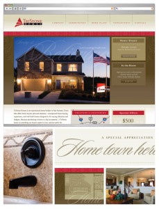
In life, there are no easy answers except maybe when it comes to web design, apparently. At least that’s what the web builder service sites want you to think. Website design is much more complicated than it seems but there are some rather simple rules that accompany it. For instance, if your web site looks professional, potential clients will think you’re professional and then engage your services. A properly constructed website indicates a business that has enough clients and enough income to have invested in a smart site. Imagine how potential clients will perceive you after visiting your poorly made hand-crafted website. Let’s leave arts and crafts up to the kids.

Professional web developers, be my guest and build your own sites to your hearts’ content. IF you’ve got the know-how (and multitudes of time), then by all means, use them. But if you’re not a pro then I feel the best option for you is to invest your money in a solid company that can do a great job building your web site wisely in order to maximise the potential traffic.

It doesn’t matter what your business is. In this day and age, it is essential to have an engaging website that will eventually result in extra local and possible global business. Nowadays, local clientele often perform online searches to find what they’re looking for.  It is YOUR website that is going to encourage them to walk into YOUR business. If your future customers chance upon your many competitors and they happen to look more reputable or professional than you, you’re going to lose out. It’s an ever increasing competitive market out there and your website is the portal to potential.

Consider this. If a journalist is looking for an expert in your field to feature in her article or on her blog, they’re going to choose the business whose web site looks professional over someone who looks like they don’t know what they’re doing. Word of mouth is some of the best free advertising available to your business, but…you must build it before they come.

It's simple really: invest wisely in getting professionals to create your website and watch the traffic roll in.

Hocus Pocus

web builder templatesWeb builder services offer seductive promises like the ability to create a professional website in just a few hours. They tout web design as being as easy as choosing a few templates and complimentary colour schemes. There’s no denying that these promises are tantalising to business owners who are already under a lot of pressure with day to day work and perhaps dwindling bank balances. If you look past these guarantees what you’ll find is that they end up delivering websites with clunky editors, cluttered back-ends and virtually no traffic. There is no support available to you once you get your DIY website up and running and often implementing change is difficult. Have a look at their customer feedback sections and you’ll see that these promises aren’t what they seem at all: they’re cheap tricks.

People think that they’ll save time and money if they do their own web design because that’s how web builder pages advertise themselves. How hard can it be? With all the available software for creating your own web page, there is clearly a market. However, in the long run, what exactly are you saving? How is it advantageous to avoid spending time and money at the beginning resulting in an ineffective web page? Web development on the cheap might get you started but you’ll have to continue to get it redeveloped in order to compete with your competitors who did it properly from the get-go.

When you choose to have a website created for your business, you’re not just looking for a basic online platform for goods and services. It’s critical that your website services your needs in multiple ways: it has to be able to load quickly, it has to be linked up properly and effectively to various social media and most importantly, it needs to be visible in the major search engines. Not one web builder service guarantees any of these vital aspects. They’re predominantly concerned with saving you money.

Let’s Get Philosophical 

The problem is and has always been: money. Most people don’t know how much good web design costs or how much it should cost. The best way to look at it is subjectively. The website design we produce for your business is not only a product, it is a service. Building a high quality website involves a complex level of planning. High attention to detail is imperative during the early development stages and this greatly affects cost. The cost depends on what you want to offer your clients and how much of a presence you want your business to have on the web. At the end of the day, web design is like any other service and what you’re willing to pay defines the quality of the service you receive. Perhaps a better question to be asking yourself is How much is my time worth?

Let me take the art analogy even further: can there really be a price placed on a work of art? All good art is a compromise of expert technique and creativity. To most people, good web design is akin to black magic: websites are intangible entities making it difficult for people to fully understand just how much work and planning goes into creating them properly. The creative process is and isn’t a mystery. Perhaps the raw talent that an individual web designer possesses is a bit mysterious as talent is inherent, but there is a lot of practicality and technicality behind impressive web design.

At Activate Design we have an entire staff of talented artisans who design websites starting, basically, with a clever idea. However, it’s the application of expertise and knowledge that really makes our website design stand out. When choosing a company to help you with web design, you shouldn’t just be looking at creative and technical track records. A good web design company must also push themselves beyond their own creative desires to produce something that includes the client’s vision. The math is easy: your idea plus our expertise equals excellent web design.

Easy Does It

I’ve never trusted the idea of ‘easy’. If web design was that easy to do, wouldn’t there be a higher level of design apparent on the Internet? Problems with hosting, issues with fake domain renewals and sketchy security protocols are not what you think you’re signing up for when you choose to go with web builder services but they are essentially part of the package.

As Kiwis, we are an innovative and hand-on breed. We apply our Number 8 Wire mentality to all that we do and we usually pull it off with aplomb. But when it comes to website development, we’ve got to know when to leave things in the hands of the experts otherwise the expenses could add up. A smart business owner recognises the value of having the right people in place. They don’t waste their valuable time and resources on trying to learn HTML because they are focused on growing their business.

I’ve received a lot of emails and calls from people who ventured down the DIY path only to find themselves going astray without anyone to turn to for advice.  It is only once they’re in the middle of their project, at a virtual point of no return, that they realise the whole design process is considerably more challenging than it seems. A good quality website is more than just a logo, colour scheme and content. It’s so easy! Point and click! Web builder sites claim to be “non-technical user friendly” but how will a non-technical website be customer-friendly?

Do the Right Thing

There’s nothing easier than finding the right web team that you can work with closely and build not only an excellent website, but a solid working relationship constructed on the foundations of trust and respect. These teams can serve as your media advisors and can guide you in the right direction. Just because you’re hiring a team of professionals to help you with design doesn’t mean that your input won’t factor into the decisions made. We will work with you every step of the way and everything we develop will be signed off by YOU.

At Activate Design we see effective web design as a collaboration process. We want you to come to us with your amazing, internet-altering, ground breaking dreams. But we want you to let us help make those dreams come true. After all, it’s what we do best.

Posted in Website Design

9 web design UI mistakes to avoid

http internet image Everyone makes mistakes—even web designers. However, some mistakes can be disastrous, such as those that affect traffic. You never want users to click away because the site’s interface is too complicated to navigate. According to akamai.com, 79% of shoppers who are not happy with a website will probably not return a second time. Decrease your bounce rate instead by avoiding these common web design mistakes.


1. Slow-loading web pages

The time it takes for a page to load plays an important role in a visitor’s experience. Most people do not have the patience to wait, even if it means loading web design ‘extras’. In addition, page loading time affects your search engine rankings. A study by gomez.com found that more customers abandon a website the longer it takes to load. In fact, another study on the tagman.com blog found a one-second delay can result in a 7 percent loss in customer conversions.

So how can you prevent slow loading pages?

One way is to watch out for large images. They look great, but can slow things down considerably, taking as much as 10 times as long to load than normal-sized images. There are other ways to prevent large images from becoming a problem, including compressing large images, browser caching, and combining images into CSS sprites. And never use images just for filler - they should always enhance the user experience.

2. Unclear links

Links are important, but can easily get in the way of navigation.

  • They should always be easy to identify. Unfortunately, some web designers insert links in the same colour as the rest of the text on the page, making it impossible to tell the difference.
  • The link area should also be large enough to click on. If the area is too small, users can become frustrated. There has to be some type of emphasis made to the links so that they stand out.

The same is true of visited links. If they revert to the default colour, users won’t know if they already clicked on them. Users need to understand where they have been to be able to figure out where to go next. You don’t want them to click on the same links over and over again just to end up on the same pages.

3. Confusing external links

There are two schools of thought when it comes to how to open external links. Some designers believe external links should always open in a separate window so that you don’t risk losing your visitor to another site. Other designers think it’s better to give the user an option. Their argument is that opening extra windows can be confusing because it disables the Back button. A user with a small screen can also get inundated with multiple open windows. Although it is a personal web designing decision, it is probably best to have links open in a separate window so that you reduce lost traffic.

4. Missing search functions

Most users have some idea what they are looking for when they go to a web page. If a website is more than a single page, a search bar is essential. Even though there are users who prefer to search Google regardless of the search bar on your website, leaving it out will alienate many users. According to user testing by Nielsen Norman Group, web users expect a website to have a search box with a button labeled “search” that provides a search engine results page (SERP). Including a search function is easy. There is no need to code your own. Either use the built-in search functionality of a WordPress platform or install a Google search bar on your site so users don’t have to leave.

5. Registration rules

There are few things more frustrating on the Internet than finding a website that has what you think you need, only to be required to register before you can actually see it. It is a waste of time, especially if it turns out not to be what you were really looking for. Don’t alienate your visitors. At least give users try out the site so they can make an educated decision about whether or not to register. If you believe in your product, you don’t need to trick users into registering. Instead, they will like what they see and immediately want more.

6. Small mistakes

If you want to decrease your bounce rates and increase your conversation rates, the little things can make a big difference:

Don’t autoplay auto and video. Visitors find it annoying when they land on a website that starts blaring content immediately. They usually click right out of there, never to return. Let them control their own experience by giving them the option of pressing play on their own terms.

Include contact info. When visitors go to your site to find out how to reach someone, they don’t want to be disappointed. Clicking around a website to find contact information is just plain annoying. It is good customer service to display your contact info clearly on your landing page. It doesn’t have to be your personal information - calls don’t have to go to your mobile. But at least post an email or contact form that bots don’t scan. You can even direct them to your Twitter or Facebook page.

Store the important stuff. The one thing worse than having to enter information on a website is having to do it twice. Don’t ask visitors for information they just gave you. If the data is important enough that you need it, save it automatically the first time.

Communicate. Things happen. No matter how well you stay on top of your site, sometimes visitors are going to end up with an Error Message. Don’t leave them hanging. Briefly explain what happened on the Error Page. And while you’re at it, why not add a link back to the homepage so they can get back on track. Adding a search bar is a bonus.

7. Design inconsistency

Although an attractive website is important, readability is the key to an effective website. Gear your site toward your target audience, because it has a direct impact on how they see the quality of your business and services.  The site should behave the way a user expects it to so that they always feel in control of the experience.

For example:

Text needs to be scannable. What’s the best way to achieve that?

  • Small chunks of text
  • Bulleted lists
  • Highlighted key words
  • Larger font size
  • Appropriate font
  • Line height
  • Contrast
  • Simple writing

Don’t add distractions like confusing background colours, strange links colours, etc. Your design principles need to remain fluid.

8. Alienating your visitors

Incorporate graceful degradation or progressive enhancement, complicated sounding terms for very simple concepts.

Graceful degradation is the process of building functionality while keeping in mind the needs of all of your visitors - even those with lower level browsers. You can design your site for modern browsers, but still make it usable for people who never update their browsers. You don’t want to lose those visitors.

Progressive enhancement is the reverse. Design your site for lower level browsers but have it increase functionality automatically for visitors with more advanced browsers. You can’t control what type of browser your visitor is using, so be proactive.

While you are at it, test your layout in several browsers, or at least Firefox, Chrome and Internet Explorer. It should work in all three.

9. Off-putting carousels

Anyone with access to the Internet knows that if a promo box looks like an advertisement, people are going to ignore it - especially if it is located on the right side of the page. (Studies show that people look to the left first when reading a web page.) Carousels are just as useless. They look like ads. Auto-rotating carousels - those that show a new panel every 5 seconds or so - are the worst. Most people don’t’ have time to read the text before it disappears and won’t want to wait around for it to come back. Auto-rotating carousels are particularly frustrating for people for whom English is not their first language and slow readers.

Remember…keep it simple.

….And three last mistakes to avoid:

  • Never design a full Flash website. A large number of mobile devices don’t support Flash, making it a bad idea to put important content in it. When the dreaded blank box appears on a screen, you’ve just lost another visitor. Switch to HTML5 for your videos.
  • Stay away from animated GIFs. They are so distracting that your visitor doesn’t know where to look first. As are too many widgets. There are some you need to include for social media purposes, but many of them are just a waste of space.
  • No horizontal scrolling. Ever.

Check out your website - have you made any of these mistakes? Fortunately most of them are quick fixes and the team at Activate is happy to help out. And next time you design a website, keep these ideas in mind so you can build traffic, keep visitors coming back and boost those conversions.

Posted in Website Design, Web Design Trends, Marketing

Making Websites Accessible on Smartphones

In recent months there have been some exciting yet curiously slow-moving technological ventures into smartphones as watches, smart glass and other creative replacement devices for our highly valued and versatile pocket technology - our iphones and android phones. I say 'slow-moving' only because these alternative devices haven't become the 'must-haves' to the extent that smartphones continue to be. However, these ventures into new devices have highlighted the fact that it's our smartphones that we most assuredly rely on, and despite the possibilities for a trendy new device to eclipse them, it's our smartphones that we are sure to be carrying with us for many, many years to come.

stack of smartphonesSmartphones have evolved to become much more than just our personal communication devices - they are internet browsers, social networking platforms, music players, personal assistants and personal development tracking. They are the link to our online presence, our access to business and personal data, and the way that we both map and navigate through our lives.

Desktop computers still look to have a place in our lives for years to come, but it's our mobile devices that accompany us wherever we go. These small devices have become something that many would freely admit they couldn't do without - enabling us to connect with family, friends and the local, national and international businesses that are part of our everyday lives.

If you have an online presence for your business you need to ask yourself - can my website can be accessed on a mobile device so my current and potential customers can find me? A smartphone is fast becoming the most common device used for internet browsing today, so if your business is not visible online via a mobile device, you're missing out.

Is your website simple to view on a mobile device? It may be accessible, but is it simple? If it's too hard to navigate your website on a smartphone, or other mobile device such as ipad, then your online audience will simply give up and try the next website and business in your industry. The scary fact is, once you lose the interest of those potential customers then you've usually lost them for good. First impressions count, and this simple truth certainly applies to the impression that your online presence makes on your viewers.

Making your website smartphone savvy

For an accessible, professional online presence for your business, let's look at these two simple options:

A Mobile Website

This is a separate website to your existing business website. A mobile site is designed and built to be as efficient as possible, with a layout that puts your most important business aspects at the forefront of the user experience for simple access to your most important information, including bookings, purchases, image galleries, events, current projects, contact information, location and more.

For simplicity of user experience, often a mobile website does not include ALL of the information that your original website does. This fact can become an issue and is something you will need to factor in when deciding between a mobile site vs responsive website for your business.

housemart mobile website on smartphone

A Responsive Website

Making your existing website responsive is something our experienced programmers can do. We utilise a responsive framework when building our new websites, and we can also make programming alterations to existing websites to ensure they too can function as a responsive sites.

To have a 'responsive website' simply means that when your website is accessed on a mobile device (iphone, android phone or ipad), your website will automatically restructure its layout and text size based on the size of the screen it is being viewed on. Very clever. This means that regardless of the device that the viewer is browsing on, they will have the best possible experience on your site.

If you look at these two examples of a mobile site versus a responsive site, you can clearly see the difference. Our responsive website is visible on the screen, but is going to require a bit of scrolling around and zooming in and out to find what you want. However, as a bonus - because it is your actual website all of your information is available.

The mobile site, however, is a lot simpler to use and view and can be designed to promote exactly the products, services or highlights of your business that you wish to project. It looks cleaner and simpler on screen, but generally a mobile site would not contain all of the information that is on your main website. Also, because it is a separate site keep in mind that it may incur additional website hosting fees.

So there's a brief look into the options for making sure your online audience has the best possible chance of finding you and staying on your website to view what you have to offer.

You're very welcome to contact us for more information or advice on the right online solution for your business, and remember that whether or not our iphones, android phones or ipads evolve as glasses, watches or some other yet undiscovered medium such a rings, caps or fobwatches, our smartphones will remain the first choice for online browsing for some time to come. To be competitive, all businesses need to ensure that their internet savvy audience can access their websites on any device, simply and easily.

Posted in Website Design

The Benefits of a website blog

Many businesses today have discovered the value of a Blog as a way to offer information on what their business is doing. A blog can provide interesting news, free business information and free business tips on a variety of topics. You may wish to blog about what you offer, announce an upcoming event, report on a recent event, showcase a new product or service or let people know about any benefits or knowledge that can be gained by your niche business.

blog_imageA blog is an alternative to a loud and obvious advertising and marketing campaign, seen through the eyes of a discerning online audience.

A blog is something people find when they are looking for it, or are directed to it, which means your online audience actually want to know more about you!

If you look at it this way, you will see that when blogging, the value of the information you offer is greatly increased.

You can let people know about your blogs to boost your website audience, for example, a brief Facebook post stating that you've just blogged about an amazing new product will bring people to your blog page, and thus your website, to find out more.

A blog that runs through your website is also kept indefinitely, so you can keep referring people back to old posts that may be useful in an ongoing manner, such as instructions or explanations on a topic, or freebies like games or recipes.

A blog can be beneficial to business for many reasons, including:

You have the option to Blog to the public or exclusively to members only. A Blog can be for your whole website audience, or it can be only for members of your organisation. We can run a dual blog on your website which means you can decide which entries are provided to a group that must first log in to view them, and which are visible to the public. Managing control of your blog in our CMS (content management system) is very simple and straightforward, making your regular blogging experience an enjoyable one. An example of a recent dual blog we created was for www.christchurchrsa.og.nz. This organisation wanted to provide information to the public as well as information that was relevant only to members, which was achieved through a "member's login area".

Quick Q&A: What is a website members login area?

In our website CMS (content management system) we can create a members login area, an area where members of your group can access exclusive information such as a blog, forum, recent news feed, and perhaps your groups constitution and rules. Members would be able to post on the forum, and the forum itself can contain several different sections - for example: buy and sell, and events section, and perhaps a projects/examples or instructions section. We can tailor your website group forum to suit your organisation.

A blog can increase website search engine rankings. One of the ways that search engines connect your website to your audience through keywords so using your blog to write about your business, incorporating keywords relevant to you, is smart marketing.

Get people talking about you with a blog. If you are offering concise and relevant information to your audience, they will have a reason to tell others to visit your website to discover your expertise for themselves, thus increasing your online audience and potentially your customer base.

Encouraging interaction through blog conversations. Send out a welcome for people to contact you regarding your blogs. Ask them to send their project examples, questions, comments and issues so you can provide feedback and begin correspondence. Your correspondence may earn you respect as a knowledgable and helpful professional in your industry.

Use your blog to tell your story. People don't want to just hear your sales spiel. They want to know how you got to where you are. They want to know you are real by knowing your story. Use your blog as a platform to be real and honest, telling your story and proving the legitimacy of your status as an industry expert.

Inspire others through blogging. A website is a place that people often skim for information rather than reading in depth. A blog can be a place to summarise the different products and services that you offer, promoting them individually and with more information. A single topic outlined in a blog may inspire a potential customer to try that particular product or service and inspire them to take a new direction in their own business or personal project.

Have fun with your blog! Blogging can become addictive. Some businesses start off viewing a blog as a chore, but it can quickly become an opportunity to share what you are doing, further motivating businesses to put their boundaries. This may be with a new product, new project, sharing a recent event, or in response to correspondence with your website visitors and customers.

Get more attention and earn more respect for your business by making the most of a business blog on your website. Bring in a wider audience by writing about relevant topics to your industry, and it's even worth doing a bit of online research to find out what people are looking for and what solutions your products and services can provide to an online audience. The wording is most important so ensure you include lots of keywords that resonate with your business, but including images of what you do will greatly enhance your blog - keeping in mind that an online audience by nature, is skim readers so any imagery will generate further interest and keep them reading for longer.

If your blogs are genuine and provide a benefit to readers, you may earn the attention of the media - another great benefit of having your own business blog!

One more tip would be - ensure your blog posts do offer something of value, rather than being a sales spiel. Offering a "how-to" or a bit of history on a product or service and how it came to be, is far more interesting than a simple "buy now because..!" I know of a company that includes recipes on their blog, which wisely enough, has their audience coming back, again and again, to see what's new. What can you offer your online audience to keep them coming back, and to tempt them into looking further into your business and industry expertise?

Quick Q&A: Should I use Facebook and Twitter and Blog?

I would compare these strains of social media thus - if Twitter is like a calling card, then Facebook is like a phone call, and Blogging is more like a conversation. It's not there to shout out a quickfire message, nor is it there to provide a blurb with accompanying image. A Blog is well-intentioned and (hopefully) useful information.

You can use Twitter and Facebook to let people know about your latest blog topics. By adding a quick note to your other social media sites, you welcome an audience back to your blog page, and cleverly enough - to your website and the rest of your business information, product and services. Alternatively have a little faith in the quality of your blog posts, that through them your audience will find you.


Posted in Website Design

Web tips for non-profit organisations

I am involved in several groups and non-profit organisations and because of my involvement in the I.T. Industry, I’m often asked key questions about what are the right online tools to benefit non-profit organisations and small businesses. So here’s some insight and advice I'm passing on which I hope will be of some benefit to your group.

It’s certainly a challenge for small organisations to find the time to choose the the right online tools from the large selection available, and sometimes a bigger challenge to find the right motivated and dedicated people to manage them!

The right promotional tool for business and non-profits usually comes down to – What is the easiest solution? What is the most popular? Whatever you decide my most valuable advice is this - have a website. A website offers you control of your content, assurance of no hidden costs or changing rules, and a reliable place for members and the public alike to find you. Your website should be something that is straightforward and easy to edit, to avoid further costs for any small changes and updates as required.

With so many social media options available, it’s hard to know where to start, so here’s an introduction into what online tools would benefit non-profit organisations and small businesses, and how to tie them all together to make online social media easier…

youtube video stillYouTube

YouTube can be a great tool for non-profit organisations, as video is such a powerful tool for sharing and teaching skills and crafts in a huge range of topics; from woodworking to knitting, jewellery making to book-binding and more.

You can make YouTube work for you by showing what you do, and from there directing people back to you website to contact you, and/or view more information about what you can offer, including membership opportunities.

Emailing

All groups and individuals need to be aware that large amounts of emails being sent from one email address can raise warning flags. This may result in your email address being marked as a spam source and becoming blacklisted.

Emailing all your members is fine, and it can work well but - it can also backfire. Be aware of the danger of sending bulk emails to large list of contacts, especially as your member list is constantly increasing. Sending bulk emails can be risky.

twitter_cookiesTwitter

Twitter is an online networking service that enables individuals to send and read short messages of only 140 characters max. Using Twitter (or 'tweeting') is commonly known as “microblogging”.

For small groups this is a good way to get known, invite new members, as keep up with what’s going on in similar organisations. Ask us about having your tweets run through your website, or linking your Facebook posts to your Twitter account.

Newsletter Systems

I recommend to many groups to look at using a Newsletter System instead of bulk emailing. Rather than emailing all of your members, look at the option of using a newsletter system like ActiveMail. There are some really good, simple-to-use email systems available, that can complement your group identity and brand with a custom email template design. Click here for ActiveMail newsletter pricing.

For more information on sending beautifully designed email newsletters to your non-profit group members or small business customers, take a look at the ActiveMail Email Marketing System. This is a very easy to use and straightforward system with a variety of helpful tools available, including real-time statistics on who has viewed your email, what links they have clicked on, what interests them, and more.

facebook_pillowFacebook

I’m often asked; “It okay that I only have a Facebook page for my organisation?” Let’s just say, it’s not ideal.

Having a Facebook page can certainly be a good thing; it’s a great way for other Facebook users to find you and to send you messages, but it's not a reliable home-base.

The challenge with Facebook is that the rules are constantly changing. Where once you could post to all your follows, now it’s just not the case as Facebook continues to move away from supporting groups and businesses and focuses more on user-pays. My advice, use your posts to simply keep referring people to your website.

Blog

A blog is a great tool for sending updates, but how do you get it out to members? Usually people email it, and run across the same issues as above, with Blacklisting and email ending up in spam folders. At Activate Design we integrate blogs into our websites so that members can simply check your website for updates and view all of your recent and historical blog posts.

These days a website is simply a must, and if you don't have one you're missing out on wider audience and the ease of connecting to group member or new customers.

Contact us today to discuss how you can have a clean, modern and professional website for your business or organisation, and what social media and additional functionality would benefit your unique group.


Posted in Website Design

Web design trends to consider on your Website

This year is turning out to be a very interesting and exciting one in terms of web development. We’re shifting toward an Internet experience that’s embracing the popularity of mobile and tablet browsing, as well as making use of high-definition displays.

Responsive DesignCombined with a growing interest in more creative non-fiction style writing and a move to using the webpage almost as an artistic medium, 2014 is about innovation while focusing on a streamlined visual identity that thrives on a minimalistic and unified experience through the use of flat design, easy navigation and focused colour schemes. Developing a site with these top trends in mind will ensure the best possible reception of a site’s content and overall function.

Fixed Navigation Bars

To start, if there’s one fact to make clear about web design trends in 2014, it’s that users should be able to easily navigate the content of the site. The days of clunky user interfaces in an attempt to showcase complex code are over. Fortunately, there’s no secret amount of internet wizardry to master here; it boils down to a straightforward design with the use of a fixed navigational bar.

Nova Crystallis, a site covering a popular video game franchise, demonstrates this design technique very well; everything is easy to navigate and find here. Regardless of where you are on the site, you can quickly access other areas.

Additionally, the animations in the menus aren’t terribly distracting and flow quite naturally; they allow ease of access to different portions of the site while still keeping everything in one central location that the user can find. Here’s what to take away:

  • Fixed navigation facilitates ease of transition through the site

  • Animations should work in a simplistic nature that’s unobtrusive and aids the user.

Slide Structure and Arrangement

Another growing trend is the use of slides to make up the look of a site. These are commonly orchestrated in a grid-like fashion. Sites like WNYC’s homepage use this to good effect, and the influence of this design has extended into apps like Flipbook or Windows 8’s new user interface.

Organizing slides into a grid-like style helps to lay out content in a way that’s visually appealing, works with contemporary trends, and also makes for easier browsing on tablet computers.

Endless Scrolling

Speaking of tablets, 2014 is also looking to become the year of endless scrolling. Skittles’ own website is a good example of this. While it slightly departs from the fixed navigation mentioned earlier, it still allows for information to be accessed quite easily.

How well this works on a desktop environment is debatable, but one fact is certain: The endless scrolling trend is clearly an extension of the growing numbers of tablet and smartphone users, and this is not something to be ignored. All recent reports have indicated that 2014 ought to be seen as the complete embracing of a more mobile accessed Internet, and endless scrolling fits best here. It’s also an opportunity to make something creative with the technique.

  • Endless scrolling sites like Skittles follow the nature of tablet and smartphone browsing

  • They allow for a unique and creative presentation of content.

Parallax Design

Scrolling has also paved the way for inventive forms of web design in 2014 through the use of parallax design: positioning two-dimensional images in such a way that through simple animation or scrolling, they move and create the illusion of three-dimensions.  The question of how long this is going to remain popular is certainly worth asking; it’s easy to think that this might just be another craze similar to the overuse of Flash sites in the 2000’s. Right now, however, it’s certainly one of the top trends and helps to offer an interesting aesthetic to work with the nature of endless scrolling.

Parallax design offers a way to achieve an animated look that can work right alongside sites that utilize large amounts of scrolling.

Responsive Web Design

Given that smartphones and tablets are becoming the new standard of web browsing in 2014, it goes without saying that responsive web design is worth understanding. Offering a duplicate version of a website that redirects mobile browsers has proven to be a clunky and more difficult solution to this, and will most likely see a steep decline in its use throughout the course of 2014 and beyond. This will be much to the benefit of the user, who can access the same content regardless of the device used, and to the developer who can focus on one main site.

There are very few reasons, if any, to offer a sub-domain mobile version of a website in 2014. Responsive design achieves unity across different devices and gives developers a more focused task.

Flat Design

Websites in 2014 are less interested in skeumorphic design (the simulating of real world, tactile objects, like those seen in earlier versions of iOS software) and are trending toward flat design. Again, Apple’s iOS shows a very good example of this aesthetic preference after their update to iOS 7; the same can be said for Windows 8.

There’s no need to try and make websites simulate real-world objects like physical paper notebooks or actual buttons for your links and items on the navigation bar. The average Internet user in 2014 expects and prefers a flat design that they’re already seeing in their computer, mobile and tablet operating systems. Working with this trend facilitates a seamlessly integrated nature with other sites and the devices being used to browse them.

Flat design is hugely popular across websites and operating systems. There’s a general desire to work with the nature of computer screens and not to try and make it look like anything it’s not. It’s honest design. User interfaces across web sites, software and operating systems are all moving in this direction.

Focused, Simple and Monochromatic Colour Schemes

Colour is another hot area in 2014 with the goal being to create a uniform or thematic look to a site and its content. This is where monochromatic trends and the use of very simple colour motifs come into play. This can be summed up into a few basic ideas and points:

  • Colour schemes are about simplicity, unity and can help to foster brand identity.

  • Try to make the most creative use of a limited colour palette. Again, this creates a unity to your content that is very appealing in today’s world.

  • Correct use of colours helps to create an association between the colour and your site’s content and/or products. This is a classic rule of advertising and can be taken advantage of with the trends of monochromatic themes in web design. Think Facebook’s heavy use of blue, Forbes’ gray theme, the BBC’s red banners, or the video game website Kotaku’s use of pink and yellow over a white background.

Large Images and Photojournalistic Approaches

Large images are another popular and welcomed trend in 2014. The best way to think of this is perhaps by creating a very similar feeling to a large magazine spread with excellent photojournalism - but taking advantage of the flat seamless design that can be achieved on a computer or tablet screen.

A wonderful example can be found over at ESPN’s Grantland feature on the Iditarod race trail. Again, the first image seen is a beautiful vista that nearly fills the whole screen and scrolls on to the content below; this is perfect for tablets, looks great on large, crisp high-definition displays and feels like the layout for a magazine enhanced in a digital environment. This example also ties into a lot of what’s mentioned above: endless scrolling, flat design, uniform colour schemes, and even some very slight and tasteful use of parallax scrolling. The videos mixed in are also a nice and very popular trend we’re seeing across the Internet.

Filling the screen with gorgeous images not only takes advantage of high-definition screens but also looks wonderful and helps to create a strong ambiance on a page that ties into your content.

Fonts and Typography

One last thing in terms of the visual imagery of top web sites in 2014 is the use of different fonts and typography. We’ve shifted away from a central focus on ‘web-safe fonts’ and have begun to embrace the advantages that playing with different lettering styles can offer; this is largely to do with an increase in compatibility. This is something that’s still very much coming into its own form and will continue to evolve throughout the year; essentially, it’s a great opportunity to get visually creative with text.

The old restraints on fonts and typographies have been broken. Playing with different lettering can and should be encouraged. Finding ways to make text work in unison with the rest of the content and visual aesthetics of a site makes a site stand out.

Content in 2014

Content is also undergoing some massive shifts. One of the top web design trends currently is a move toward rich storytelling in an almost creative non-fiction style. This of course will always depend on the content focused on, but the more you can focus on narrative, the better; it’s a beautiful opportunity to invest in some creative talent that can help to create stimulating and engaging content.

Again, the ESPN example above really highlights this. What could’ve been a straightforward fact-reporting news story was turned into an entertaining narrative about sled dog racing.

Another excellent example of this that’s worth taking a look at is the New York Times’ Pulitzer Prize winning feature, Snow Fall. Again, something that could’ve been ‘just the facts’ was used to create an engaging piece of creative non-fiction that also utilizes some great scrolling, large images and video throughout the piece. The same passion for creating engaging content can be used for something as simple as a description of a consumer electronic product, as is the case with Polygon’s review of the PlayStation 4 video game system.

Content that tells a story and does so with good narrative structure is emerging as one of the top trends in 2014. Investing in creative non-fiction style content makes the experience of reading the content worthwhile.

Even simple subjects like product overviews are being done with creative flair. This approach flourishes alongside scrolling, parallax design, large images and video content.

Portraits

Following with making web pages that have some more creative substance, 2014 is also about the use of portrait pictures that identify with the focus of the site. Taking a look at Andrea Mann’s or Steve Vai’s website, the focus on a large portrait on the home page really gives a sense of what the content is about and both personalizes and humanizes the page. The same basic idea works even if the website isn’t about a particular person. Wizards of the Coast has a great example of featuring large portrait-style images on their site that give a good sense of the types of products, services, or content they offer.

  • Top websites are focusing on showing what they’re about through the use of large portraits that help to grab the attention of the user.

  • Portrait methods can be used to stylize content that might not even involve actual people.

Less Text

The trend towards rich, creative style storytelling experiences on webpages by no means suggests that you need to fill pages with as much text as possible. In fact, there has been a general direction toward less text on web pages in 2014. If a site can always be described with less text, making more use of images and video, as is the case with a site like Phonebloks or even Apple, it should.

Top web trends show that if there’s no need for the text, a site can be received very well through the use of simple, to-the-point text that utilizes images and video to help carry the content.

We’re seeing a lot of freedom spread throughout the Internet in terms of design. The trending nature of flat user interfaces, an emphasis on scrolling, photojournalistic techniques and storytelling styled narratives are proving to be the best designs and are really shaping websites into something more intuitive, human and artistic. These trends are in many ways extensions from user tendencies in terms of web browsing, a sort of bottom up influence and can really help a site fit what’s already expected from the user end.

For more information on top web design techniques, contact us here at Activate.


Posted in Website Design

Knowing Your Website Options

YES WE CAN MAKE IT WORK ~ JUST LET US KNOW WHAT YOU WANT

Would you like an easy to edit website? Our websites are unique. We use a CMS (content management system) that has been developed by us, specifically to make it easier for our customers to edit their own websites. This makes keeping your website up to date easy and saves you money!

Would you like a website that is not locked into one host provider? Our WEP-2 system can be transferred to another host provider on request. We certainly recommend that you host with us, as our systems are optimised for high performance of the websites that we develop. Our NZ-based hosting service includes daily and weekly offsite backups. For WEP-2 websites there is no locked-in hosting.

Would you like website training and support for your site? Training on how to use our simple CMS system is included with each website. We provide ongoing support through our Support Ticket system, and are here 9 -5 to take your calls.

Would you like lots of optional website features? We can create the functionality that will best benefit your business. Here are some ideas for website feature functionality that can be quoted on and added on when you need it:

  • Blog Modules
  • Calendars
  • Booking System Integrations
  • Wholesale Customers Modules
  • Product Databases
  • Responsive Website Coding
  • Login File Storage Areas
  • Quote and Invoice Functionality
  • Upgrades to E-Commerce

We have unlimited options for website functionality and are always designing and developing new features to suit our client's needs.

Would you like your current website to be easily editable? For a selection of new customers that come to us, their needs are simply focused on being able to edit their existing websites themselves.

Some businesses just want:

  • The ability to edit their website without incurring extra costs.
  • The process of editing their website to be simple, without having to navigate cms systems that cater to programmers and html adepts.
  • The option to expand their website, adding new pages and functionality to evolve alongside their business expansion - without incurring exorbitant costs for a whole new website for each additional function.
  • The option of an updated and refreshed website design at a later time.
  • Automatic system upgrades as they become available, for a long-term website investment.

For the people that come to us wanting a website for their business, we simply say: "YES WE CAN MAKE IT WORK ~ JUST LET US KNOW WHAT YOU WANT"

Contact us today for a phone chat, or if you are in the Christchurch or Queenstown central areas, contact us to book a meeting and let's discuss what features and functionality would best suit your business, and how we can create exactly what you want.

Posted in Website Design

2014's Top 3 Web Design Software | Activate Design

The days of text-only websites and spacer GIFs are long behind us. Today, websites are far more than sources of information; with graphic design, advanced coding and portable capabilities, websites are irreplaceable parts of every effective marketing strategy.

It’s rare to find a successful business today that doesn’t have a professional website. After all, every company could benefit from global exposure. But no matter what your industry, there are three elements that really define the quality of a webpage: looks, functionality and adjustability.

That may not be the latest secret in the digital world, but what many people don’t know is how new web design software are making professional sites easier than ever to create. This article will introduce a few software that will help developers save time and produce more advanced sites in 2014.

1. Xara Web Designer MX

It’s fairly common knowledge that WordPress offers a simple platform for novice designers. The content-management system (CMS) and versatile plugins make WP pages easy to develop and edit.

But WordPress, however useful it may be, still has its disadvantages. The biggest, perhaps, is its limited ability to design cutting-edge websites.

That’s where Xara Web Designer MX comes in. Like WordPress, Xara Web Designer MX offers a CMS platform but with advanced design capabilities, including:

  • Automatic image optimisation by resampling to 96dpi and saving as a PNG, eliminating the need of separate image-editing software
  • Advanced functionality, like pop-up images and mouse rollovers
  • Layer-based design that makes sophisticated websites easier to create
  • Thirty-three templates with customisable designs and colour schemes

As more start-ups take a swing at digital design, platforms like Xara Web Designer MX will only become more popular in 2014. Who knows? Maybe it will replace WordPress as the go-to software for novice developers.

For more information about the Xara Web Designer MX, visit ExpertReviews.co.uk.

2. CoffeeCup Free HTML Editor

The free version of CoffeeCup HTML Editor lacks a few features of the commercial software, but unless you’re a professional programmer, you probably won’t notice.

Although we don’t encourage the duplication of other sites, CoffeeCup HTML Editor makes it easy for businesses to examine and tweak the layout and content of an existing webpage. This could save loads of time in the layout-planning stage.

For more information about CoffeeCup Free HTML Editor, visit TechRadar.com.

3. Firebug

So, your website is just about ready, but it doesn’t quite work or look exactly how you’d like. Firebug can help here by taking care of vital yet sophisticated design techniques, including:

  • CSS coding
  • JavaScript debugging
  • Style adjustments
  • Cookie management
  • Load-time analysis

Web experts stand to gain just as much from using Firebug as newbies. It’s truly a powerful extension that can improve visitor experience and enhance website aesthetics and functionality.

Deciding to Go It Alone or Hire a Professional Web Designer

This is a decision that almost every modern business will face, and the right option really depends on your goals. A professional site, as you no doubt have heard, can be an incredible asset, expanding market reach, providing customers easy access to your services and, ultimately, driving more sales.

As an added bonus, professional designers can offer a mobile responsive website. You can follow this link to learn the benefits of developing a mobile website.

In either case, the right web design software can take your site to the next level. Some of these programs are free and easy to use; others cost money. For detailed reviews and cost analyses of website software, check out this article on TopTenReviews.com.


Posted in Website Design

Knowing what you want in a website

Website Information for New Projects

Can you change hosting when you choose? Or are you locked in to a plan? Do you own your website? What is a domain name and who owns the domain? There are so many things to know when deciding a website but really, it can be quite simple and I will try to explain it so;


Having a website created will involve these steps;

1. Spend time looking at other websites to see what you like. Have a look at websites in general, and websites in your industry.

See if there is anything that stands out for you, that you like, and any functionality that you would want on your own website. Doing this will give you a better idea of how your own website can surpass your competitors and give you a unique edge. This is something that any good creative agency would do anyway, but it gives you a chance to know what you want and be able to ask for exactly what you want.

Stepping Stones to Website Development

2. Talking to a creative design studio.

Meet with a representative from one or more design studios.

a. The Design Studio representative:

This person should have full knowledge of all I.T. innovation and be able to advise on the right website solution for you. Ensure they spark your enthusiasm about undertaking a website project because it is an investment that will need your input into the content, and your commitment to completion.

b. Future Costs for website changes: Keep in mind that there may be functionality on your website that you don't need right now, but that you may wish to include later. Ensure that these add-ons are possible with the website you will be getting, and what the cost of adding them on will be.

For example; you may wish to sell online in future, but for now a portfolio-type site would suit you best. How much to add a product database and payment functionality in future? You may wish to add small things at a later date, such as a link to a business Facebook page or a twitter feed, or you may want simple changes done such as removing or replacing an image or text.

You need to know how much your design agency will be charging you for any changes and additions once your website is up and running, and ensure you will receive a fair rate.

Strategy for Website Design

c. Website Hosting: Hosting is like paying for a carpark, it is paying for the space that a website takes up on a server. Ask how much will it hosting cost. Is it charged monthly or annually? It may be advisable to phone around if you're not sure what fair hosting prices should be.

Is your website going to be hosting on a secure New Zealand based server? If not, there could be delays in getting changes done if it's hosted somewhere overseas. It may also end up being much slower to load that a site that is hosted locally.

Can you move your website to another host provider when you choose, or are you locked into a contract? This may also be a deciding factor for what type of site you choose to go with as some websites have a centralised database and cannot be moved, but others are independent and can be moved easily. Check how much notice you need to give to move a site or cancel your hosting to allow yourself that flexibility.

A warning about ownership : a rare practice that you need to be very aware of is that some design agencies claim to own your written content and sometimes even images, if you have a site built with them. This means that even if you move your website they can take action against you if you continue to use what they see as their content. It's an unfair practice which is simply used to prevent you from ever moving your site, and it's a practice we strongly disagree with. Like your logo, your website is your investment and ownership of all content should belong to you. Limitations of shifting your hosting should only come down to the type of site that you have, thought they may include technical issues such as whether the new server that will host your website has the specifications to do so.

d. Domain Names: A domain name is like a signpost pointing to your website, for example our domain name is (activatedesign.co.nz). Your website won't be accessible without one, and it may be good to have all aspects of your website in one place.

Can the studio manage your domain name and how much do they charge for annual domain name renewal? A standard charge for a .co.nz domain name is $30+gst per year. Ensure you're getting a fair deal by phoning around if necessary.

This information should give you a starting point with which to know what questions to ask to ensure you're getting the best possible website for yourself. If you have any further questions just get in touch below.

Posted in Website Design

Gain The Advantage With A Mobile Website

There are plenty of businesses in specific industries that would greatly benefit from having a mobile version of their website. It may be that these businesses have not yet realised just what a great benefit having a mobile website is to the growing number of people who are browsing the internet on their mobile devices.websites on mobile phones

As Shown Above: Responsive Websites

Housemart.co.nz - this property management company choose to have a responsive website for the ease of their customers, some of whom will be using their mobile device to browse their website while physically visiting properties.

NZShred.co.nz - this skate, surf and street clothing store found that a responsive site best suits their customers who may local and shopping around, or among the bulk of season tourists who can view their range and location via their website on a mobile device.

avivafamilies.org.nz - instead of limiting the support that Aviva Families offer, to those browsing their site on their home computer, this company choose a responsive website so they can offer their expert family support to anyone, anywhere, with a site that is simple to view and navigate at home or on a mobile device.


BUSINESSES THAT WOULD BENEFIT FROM A MOBILE WEBSITE

I have chosen the following industries that would greatly benefit from having a mobile version of their website, based on the fact that a high percentage of people looking for these particular businesses are likely to be looking for them while browsing on a mobile device - be it a phone, tablet or iPad. People looking for these businesses are likely to be on the move rather than be sitting at a home computer.

  • Hotels
  • Motels
  • Restaurants
  • Schools
  • Takeaway businesses, ie. fish & chips / pizzerias / bakeries
  • Sports facilities – fitness centres / swimming pools
  • Dentists
  • Beauty Salons / Day Spas
  • Hair dressers
  • Auto services

Mobile Browsing for TravellersWHAT LOCAL PEOPLE ARE LOOKING FOR ON THEIR MOBILE DEVICES

Local people who are out and about may decide on the spur of the moment to visit a hairdresser, beauty salon or even a gym or swimming pool, and rather than go home to look on a computer they may want to book an appointment, get in contact, or simply find the opening hours or contact details of a business while out and about and browsing on their mobile device.

After all, deciding in the moment to get your hair done, or visit a gym, is the freedom that we enjoy from not having to always plan ahead, and the internet is the key to finding our location of choice through the flexibility of viewing a mobile website. And then there’s those unexpected times when you’re on the move and a friend urgently calls and says “can you pickup my son/daughter from school?” You want to look for their schools' website on your phone and quickly find the schools location and contact details. Are you making it easy for people to find you?


WHAT TRAVELLERS AND TOURISTS ARE LOOKING FOR ON THEIR MOBILE DEVICES

As a tourist in a new town, you may want to find a café or restaurant that serves a particular dish, so you will be browsing on your mobile device for a local takeaway such as fish n’ chips, indian, chinese or even pizza while you explore the town. Alternatively you may be looking for a local bar or restaurant to dine in, and want to find out their opening hours and the meals they have available.

As a traveller you may have a call from a friend; "plane's been delayed, we have a free day! Where can we go snowboarding, hire gear and find transport, and what hours are they available? Can we book online right now?" People want the ability to find this information quickly and efficiently.

Your car breaks down and you're on the road. Is there a mechanic with a mobile website where I can find their information and get help? Is there a motel nearby?

Does your website provide this information to a mobile device in a format specific to this kind of browsing? Trying to browse a normal website on a mobile device is frustrating and time-consuming and requires a lot of scrolling around the page.

Housemart Website Mobile Responsive


Shown Above: Responsive site vs Regular website on a Mobile

ABOVE LEFT: The image above shows what the whole Housemart website would view like on a mobile device. It clearly does not fit the format and will require a lot of zooming in and scrolling around the page to find what the information you need.

ABOVE RIGHT: This image show the responsive housemart.co.nz website as it would auto-resize to fit the mobile phone format. This information is much easier to view, and navigating the site to find select information is simple.


THE BENEFITS OF A MOBILE WEBSITE

A Mobile Website is a version of your website specifically created to make it easier to find the most important information quickly and clearly. If your competition has a mobile site and you don't, you're at a disadvantage because mobile browsing is becoming the norm, and people are looking for sites on their mobiles that are simple and straightforward.

Browsing the internet is about speed and efficiency, and if a site looks too complex then people will exit right out again to find a site that more clearly offers what they are looking for.

In the competitive world of online marketing, we need to anticipate what our target market are looking for, and ensure we are providing that information in the easiert format possible.

Contact us to discuss having a Mobile Website created for your business, today.

Posted in Website Design

Recent articles

Categories